Thursday, August 6, 2026
Novelty Sells When Your Product Page Does the Heavy Lifting
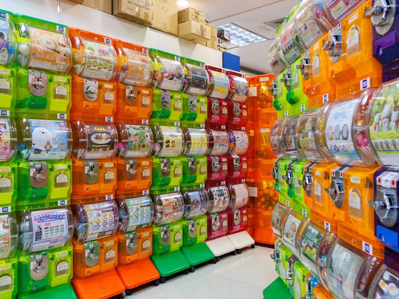
Most novelty product marketing advice is backwards
Most people try to “sell the joke” harder. More memes. More hype. More aggressive scarcity.
That’s not what converts in 2026. Novelty converts when the product page turns curiosity into clarity fast—before a buyer’s brain starts listing reasons to bounce.
The uncomfortable stat: product pages are still bad. Baymard’s 2026 benchmark shows 52% of desktop sites and 62% of mobile sites deliver “mediocre or worse” product page UX. That’s your opportunity if you build a page that answers questions cleanly. [Whatmore]
Novelty products amplify this gap. When a product is intentionally weird (or intentionally “does nothing”), the buyer’s main fear isn’t missing out. It’s getting tricked—or getting something that looks different in real life.
- Curiosity gets the click (novelty).
- Clarity gets the add-to-cart (expectations).
- Visual proof reduces returns (inspection).
So the play isn’t “be louder.” It’s “be clearer than everyone else while keeping the novelty hook.” That’s the whole game.

The 2026 curiosity-to-clarity PDP blueprint (the only one I trust)
Here’s the structure we keep coming back to when we build pages for products that are hard to explain, easy to doubt, or easy to misinterpret.
It’s a four-part “curiosity-to-clarity” blueprint: hook (novelty), proof (materials/build), expectation setting (what it is/isn’t), and visual inspection (rotation).
1) Hook (novelty) that doesn’t overpromise
Your headline should be outcome-driven, not feature-driven. That’s not a copywriting trend. It’s how humans decide quickly. [Roast]
For novelty, the “outcome” is usually emotional: a reaction, a vibe, a gift moment, an inside joke, a desk flex.
- Good: “The conversation starter you can actually hold.”
- Good: “A gift for people who already have everything.”
- Risky: “The best product you’ll ever buy.” (novelty buyers don’t believe this)
2) Proof (materials/build) that signals it’s not a scam
Novelty doesn’t mean low quality. In fact, buyers assume novelty is cheap until you prove otherwise.
This is where you earn trust with specifics: materials, dimensions, weight, finish, what’s included, how it’s made. Keep it skimmable with a clear visual hierarchy. [Me-page]
- Materials (and why you chose them)
- Exact dimensions in both inches + cm
- What’s in the box (literally list items)
- Care instructions (if relevant)
- Shipping/returns in plain English
3) Expectation setting (what it is/isn’t) to prevent refunds
This is the section most founders avoid because it feels like it will hurt conversion. It usually does the opposite.
Add a blunt “What it is / What it isn’t” block. Novelty products create imagination gaps. Refunds live in those gaps.
- What it is: “A premium-feel object designed for laughs + display.”
- What it isn’t: “A performance tool / medical device / safety product.”
- Who it’s for: “Gifts, office desks, collectors.”
- Who should skip: “Anyone expecting functional performance.”
4) Visual inspection (rotation) so the buyer can verify reality
Static photos are where novelty dies. They create one flattering angle and hide the rest. Buyers know that.
In 2026, the bar is “let me inspect it.” Not just a lifestyle shot. Not just a 10-second montage. Let them see edges, thickness, seams, texture, and scale cues.
This is also aligned with the broader design shift toward texture, imperfection, and human warmth—the anti-hyper-polished look. [Creativebloq]
How to sell a novelty product without relying on hype
If your product is “nothing,” you’re not selling utility. You’re selling meaning.
That doesn’t mean you get to be vague. It means you need product page storytelling that makes the buyer the hero, not your brand.
In B2B SaaS, interactive storytelling has been driving real lifts—Wrike reported a 65% onboarding conversion lift by embedding interactive demos into the buyer narrative, and Quantum Metric doubled conversion rates by replacing traditional videos with interactive demos. [Arcade]
The ecommerce translation is straightforward: the more “hands-on” the page feels, the less the buyer has to imagine.
The “novelty story stack” (use all 4 layers)
- Origin story (1–2 sentences): why it exists without sounding like a TED talk
- Social moment: where it shows up (office, party, gift, shelf, travel)
- Build story: why it feels legit (materials, finish, packaging)
- Receipt story: what arrives and what it looks like in real lighting
A copy pattern that works: the 3-line “plain English” block
Put this right under the price.
1) What it is.
2) What you get.
3) What happens when you use it (emotion/reaction).
- “It’s a desk object designed to get a laugh.”
- “You get: the object + display stand + protective packaging.”
- “Expect: people asking where you got it within 10 seconds.”
This is also a trust move. Reddit buyers are allergic to fluffy positioning. They want plain English and specifics.
The trust checklist: what buyers decide in the first 10 seconds
Reddit marketers talk about “trust in about 10 seconds” because it’s real. Especially for unknown brands.
You don’t earn that trust with a long About page. You earn it with green flags above the fold and zero weird surprises.
Green flags to add above the fold (steal this list)
- Clear product name + one-line plain-English description
- 3–5 review snippets (not just star rating) [Me-page]
- Shipping timeline range (not “fast shipping”)
- Returns policy in one sentence (link to details) [Me-page]
- A real photo that shows scale (hand, desk, shelf)
- A “What it is / isn’t” anchor link
What to remove (it’s killing conversion)
- Auto-playing audio/video
- Popups before the buyer has context
- Over-designed AI-looking renders (they read as fake in 2026) [Creativebloq]
- Vague guarantees like “100% satisfaction” with no policy details
Human-led creativity still wins, but it has to be anchored in clarity. Emotion plus proof beats emotion alone. [Techradar]
Visual inspection is the refund-reduction lever nobody wants to build
Returns happen when the delivered product doesn’t match the mental model.
Novelty products create especially fragile mental models because buyers fill in gaps with imagination. Your job is to remove the gaps.
The minimum viable “inspection kit” for a novelty PDP
- 1 rotating view (or 360-style view) showing edges and thickness
- 2 close-ups: texture + seams/joints
- 1 “in-hand” shot for scale
- 1 packaging photo (what arrives)
- 1 real-world lighting photo (not studio-perfect)
If you sell on Instagram or short-form video, the rotating view pulls double duty. It becomes a scroll-stopper and a conversion asset.
This is also where we use RotateProduct internally: we turn a static product image into a short rotating video so shoppers can sanity-check what they’re buying from multiple angles without us running a full 3D studio pipeline. It’s not magic. It’s just a practical way to add inspection to pages that only have flat photos.
If you don’t do this, you’re betting your margins on hope. And hope is expensive.
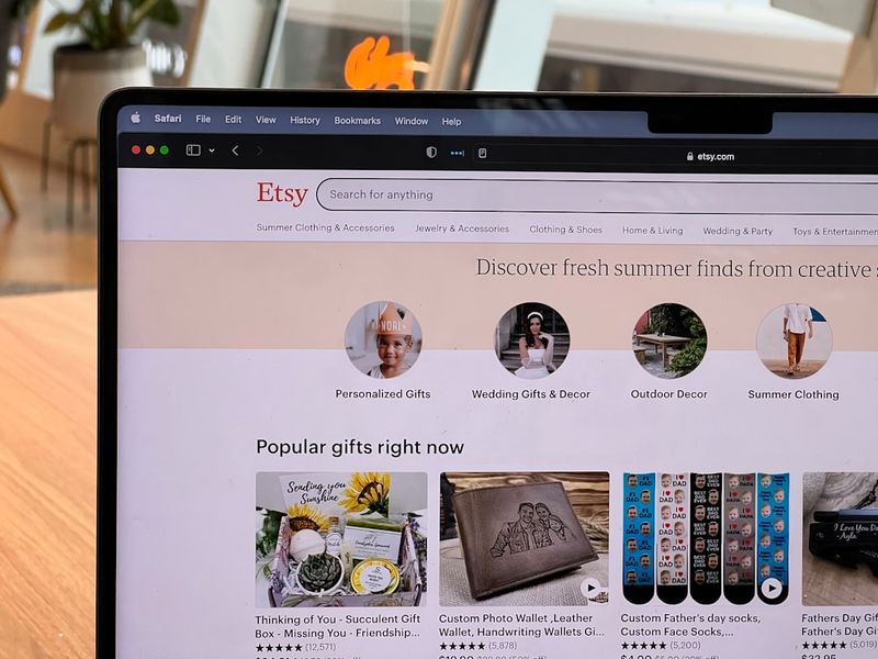
Conversion mechanics: 9 PDP elements to increase conversion rate in ecommerce
Novelty is not exempt from fundamentals. It’s punished harder when fundamentals are missing.
Below are the nine elements I’d treat as non-negotiable if you want to increase conversion rate ecommerce for novelty products in 2026.
- Outcome-driven headline (1 line) [Roast]
- Plain-English 3-line description (what it is / what you get / what happens)
- Price + shipping range visible without scrolling
- Primary CTA repeated 2–3 times on long pages (top, mid, bottom)
- Proof block: materials, dimensions, weight, what’s included [Me-page]
- Expectation block: what it is / isn’t (reduce refund drivers)
- Social proof: reviews + photos + Q&A [Me-page]
- Mobile-first layout + fast load + thumb-friendly buttons [Me-page]
- Visual inspection: rotation/360 + close-ups + scale cues
If you want a simple KPI to watch while you iterate: track add-to-cart rate and refund rate together. Novelty pages can spike conversion with hype, but the refund rate tells you whether clarity is actually working.
Inline CTA (if you want to add inspection fast): If you have solid product photos but no rotation, try generating a rotating product video with RotateProduct and drop it into your gallery. It’s the quickest way we’ve found to close the “I can’t tell what I’m buying” gap. https://rotateproduct.com
Brand demand creation: why “nothing” can sell out
The internet keeps rediscovering the same lesson: demand isn’t purely utility-driven.
A novelty product that “does nothing” can sell out because it’s a social object. It signals taste, humor, belonging, or status inside a niche. The product is the receipt for the story.
But here’s what founders miss: brand demand creation doesn’t excuse a weak PDP. Brand buys you the click. The page still has to close.
And when buyers are skeptical of AI hype and vague marketing, specificity is the brand. Plain English is the brand.
A practical demand loop for novelty (works for SaaS too)
- Novelty hook earns attention (ad, post, influencer, Reddit thread).
- PDP converts attention into clarity (proof + expectations + inspection).
- Post-purchase moment creates shareable receipts (packaging, unboxing, desk shot).
- UGC becomes the next wave of attention.
If your novelty product can’t generate a “receipt photo,” you’re leaving free distribution on the table.
Operational reality: payments, fees, and the cheapest way to accept cards
Novelty founders get stuck on the same operational question: “What’s the cheapest way to accept cards?”
Most advice online is either outdated or affiliate-driven. The real answer is: the cheapest processor is the one that doesn’t add hidden complexity, surprise holds, or dispute pain when you’re small.
Decision criteria (use this instead of comparing 20 pricing pages)
- Effective rate after all fees (not headline rate). Ask: % + fixed fee + chargeback fee + payouts/settlement fees.
- Payout speed and reserves: will they hold funds when you spike from a viral post?
- Dispute tooling: can you respond with order proof quickly?
- International cards + taxes: does it break when you sell outside your home country?
- Checkout friction: does it add steps on mobile? (mobile UX matters most) [Me-page]
A simple rule: if you can’t explain your processing costs in two sentences, you’ll eventually get surprised by them.
Also, novelty products can trigger higher dispute rates if expectations aren’t explicit. That loops back to the “what it is/isn’t” block and inspection media.
For SaaS founders: the same novelty PDP logic applies to your pricing page
SaaS founders like to pretend they don’t do novelty. Then they launch “AI agents” that sound identical to everyone else.
In 2026, feature differentiation is flatter, and product storytelling is doing more of the conversion work before a sales call. Interactive demos embedded into narrative are producing real lifts. [Arcade]
Translate the blueprint to SaaS
- Hook: the job-to-be-done outcome (not the model name).
- Proof: screenshots, workflows, integrations, security basics.
- Expectations: what it does / doesn’t do, where it fails, who shouldn’t buy.
- Inspection: interactive demo instead of a cinematic video. [Arcade]
If you’re trying to quit your 9–5, this matters because it shortens the feedback loop. A clear page gets you cleaner signals: either people want it, or they don’t. Ambiguous pages produce ambiguous results, and founders waste months “optimizing” the wrong thing.
A founder-grade workflow: ship a converting novelty PDP in 1 day
This is the workflow I’d use if I had to launch a novelty product page by tomorrow and wanted it to convert without relying on hype.
Timebox it. Don’t “design” for a week. Build the sections and get it live.
- Write the 1-line outcome headline + 3-line plain-English block (30 min).
- Draft the “What it is / isn’t” section (20 min).
- Collect proof: materials, dimensions, weight, what’s included (45 min).
- Add trust blocks above fold: shipping range, returns sentence, review snippets (45 min). [Me-page]
- Build the inspection kit: rotation/360 + close-ups + scale + packaging (2–3 hours).
- Mobile QA: buttons, load time, image compression, sticky ATC (60 min). [Me-page]
- Launch and measure: add-to-cart rate, checkout completion, refund reasons (ongoing).
If you’re stuck, start with the inspection kit. It forces you to confront what the customer can’t see yet—and that’s usually the real reason conversion is low.
Frequently Asked Questions
How do you market a novelty product without it feeling scammy?
Lead with a novelty hook, then immediately switch to proof and expectations: materials/build details, clear policies, and a “what it is/isn’t” block. Add real inspection media so buyers can verify reality. Strong visual hierarchy and trust blocks help too. [Me-page]
What’s the fastest way to increase conversion rate ecommerce for novelty items?
Improve PDP clarity and inspection: outcome-driven headline, plain-English summary, visible shipping/returns, and interactive/rotating visuals so buyers can inspect edges and texture. Many PDPs are still “mediocre,” so basic improvements can move the needle. [Whatmore]
Do interactive demos really beat product videos?
In multiple 2026 examples, interactive experiences outperformed traditional video: Quantum Metric doubled conversion rates after replacing product videos with interactive demos, and Wrike reported a 65% onboarding conversion lift by embedding interactive demos into narrative. The principle carries to ecommerce via interactive inspection. [Arcade]
What makes a startup website feel trustworthy in the first 10 seconds?
Plain English, visible policies, social proof, and no surprises. Put shipping timelines, returns clarity, review snippets, and real product photos above the fold. Avoid overly polished AI-looking visuals that can read as fake; 2026 design trends favor texture and human warmth. [Me-page][Creativebloq]
What’s the cheapest way to accept credit cards for a small business selling novelty products?
The cheapest option is the one with the lowest effective rate after all fees and the least operational risk (holds, reserves, chargebacks, payout delays). Compare processors by total effective costs, dispute tooling, payout speed, and mobile checkout friction—not just the advertised percentage. Mobile UX matters for conversion. [Me-page]